A boy from Titirangi, up the road a bit from the clay pits of my childhood wanderings, and a short coastal walk from the home and studio of the late Len Castle, a potter who first inspired me to take a closer look, perhaps it is not surprising that I now find myself elbow deep in clay.
At the end of my three-year Otago Polytechnic Diploma in Art and Design – Ceramics programme, blessed by the extraordinary generosity of spirit and the lifetimes of learning so graciously shared with me by some of Aotearoa’s most accomplished ceramic artists, my clay journey has only just begun.
Working with uku (clay) as a medium, not only brings us into direct contact with the elements of earth, water, air and fire, but more importantly, challenges us to care for the land from which we draw our materials and inspiration. It is within the space that exists between my inexperience and understanding, between the natural and made worlds, between control and release, and perhaps even between the physical and spiritual dimensions, that I find myself working as an artist.
Artist Statement
Te Mauri O Te Whenua – A Search for Papatūānuku
A personal journey that I began this year to consider the notion of faith, and in particular, how this impacts upon my ability to see the world in both physical and spiritual terms. The centrepiece of this exhibition, Te Ao Mārama, a whakapapa in clay, acknowledges both the physical and spiritual dimensions.
I am inspired by the paintings of the late Colin McCahon, a fellow resident of Titirangi for a time, an artist who said of religion that it was ‘an attitude’, a man who shared a deep spiritual connection with the land. My work It’s a question of faith, responds to McCahon’s painting Otago Peninsula (1946-49) by scraping away the surface layers to reveal the primal ground, and extricating sections of this landscape to see what lies beyond the immediate.
In respect to the interaction between the physical and spiritual dimensions, it is to Maori artist John Bevan Ford that I turn to give voice to what it is that my journey this year has been about…
The many forms of the land carry messages that go beyond the land.
The cloak is made out of the material of the land, the artist takes the
strands and weaves them. The cloak is used to warm us in a physical
sense, but the patterns and the fineness of the cloak proclaim the
sacredness of the wearer. You place the cloak over the land; you are
talking about the mana of the people, the mana of the land….
Kaitiaki stand as both physical and spiritual custodians, acknowledging the potential that exists to learn from our past and act towards a sustainable future.
The following images and text are all related to my end of year exhibition.
Seeing my name in print was very exciting indeed. After such and extraordinary diploma journey, I found myself wanting to shout out ‘I’m a real boy now’, the words of Pinocchio, a fairytale character from my childhood. Again I am very grateful to the Waiheke Art Gallery team for organising this for me.
Little Oneroa – Landforms
This set of three simplified landforms provided the provocation for this year’s body of work in a physical sense, while a conversation with a friend about faith prompted further contemplation of the existence of a spiritual dimension within the landscape.
This work brings form to the forefront. I attempt to add elements that do not subtract or split the form, but that add elements specific to place. An exploration of untried glaze application techniques.
It’s a question of faith – Landforms
McCahon inspired landforms. I strip back the painterly layers of his work Otago Peninsula (1946-49), to reveal the ground beneath, extricating sections of this landscape to see what lies beyond the immediate. The undulating surface may be suggestive of the contours of our physical human bodies, while the spiritual nature of McCahon and Papatūānuku are referenced below the surface.
These forms concentrate on clay body additions and hand-building techniques. A lesson in the use, application and concentration of black copper oxide.
Tipuna – Vessels
Stony Batter inspired forms. Rock formations standing as witness to our human impact upon the land. Repositories of the knowledge and the mauri brought to Aotearoa by tangata whenua.
Figurative work premised around rock formations. Vessels to reference migration. Slab and pinch hand building techniques. Oxide combinations to enhance form and reference place. Glaze spraying technique.
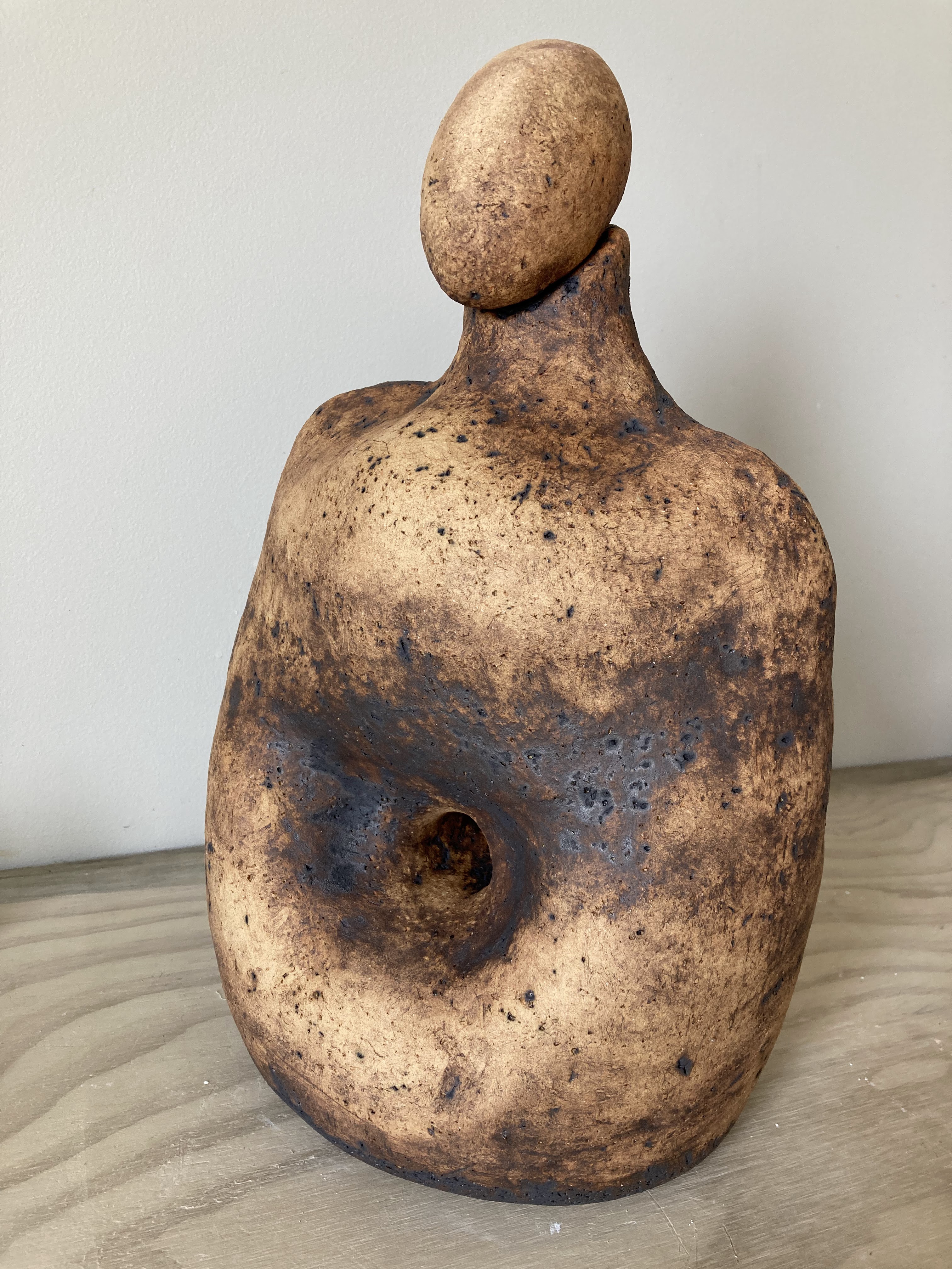
Kaitiaki – Bottle forms
Stony Batter inspired forms. Attempt to simplify the form while retaining a figurative element.
Coil building technique with clay body additions to alter surface texture. Oxide to enhance form and connect body of work through unadorned surfaces.
Te Ao Mārama – Korowai
A whakapapa in clay. Recording of histories/genealogy. A symbol of protection for the earth mother Papatūānuku. Acknowledging a spiritual dimension.
Te Ao Mārama in its permanent home (above the brass coffee table that my dad made). For me personally, this work encompasses not only my diploma journey, but also significant people, places and events that have all led me to this place and time.
Continuing my search for Papatūānuku here on Te Motu arai-roa (the long sheltering island) Waiheke Island, a drive to the ‘bottom’ end of the island reveals another of the island’s significant geological landscapes. Stony Batter, the site of a historic gun emplacement within a 50 acre DOC reserve, is home to dramatic lichen-covered rock formations scattered across the hills and valleys that are home to vineyards, farmland and incredible vistas across to the islands of Tarahiki, Pakatoa and Rotoroa. It is in response to this place that my next explorations begin. Some images taken during a recent visit below.
When faced with such dramatic forms, with their ancient claw marks and alien markings, it is not difficult to engage with the idea that there is more to this place than the eye can see. Whether imagined or not, there exists for me, an element of spiritual energy in this place. Formations are seen as the head of ancient birds frozen in place and time, or indeed ancestral sentinels, standing as guardians (kaitiaki) against that which might pose a threat to this place.
With the idea of ancestral figures having voyaged across the ocean and bringing with them the ‘baskets of knowledge’ essential for survival in a foreign land, I set about drawing and constructing a number of stone figures that incorporated the elements of ‘basket’ and ‘waka’ to give form to these thoughts. Definitely an example of how the thoughts that can seem so amazing in your head, don’t have the same amazement when taking form.
Extending on the idea that the waka and basket are a single form and carried on the shoulders of the ancestors.
Wonderings about what type of build might give form to the idea that ancestral knowledge is held within the landscape, revealed in part by the shape and texture of the object (this where it starts getting even weirder).
From these initial explorations, it is the simplified obelisk body form and rock head that might hold the key to further investigation.
Before settling on a set of three forms to take thru to glazing, thought I might consider functionalising these figures with the ‘baskets of knowledge’ idea, using waka and bowl forms as the vessels. A couple of maquette should provide an opportunity to test some glaze finishes should I continue on with these works.
Decision made to continue on with these works, although I have decided that they do not quite fit in with the narrative I am hoping to share at the end of year exhibition. Sticking with the same approach of using a wash of the oxides manganese, copper, rutile and yellow iron to accentuate the clay surface and form, and a sprayed interior glaze of turquoise, these tipuna have been completed.
With some uncertainty still lingering, still time to have another stab at extending on this theme some more. One of the considerations for this next work comes from recent conversations regarding the role the ‘void’ plays in ceramic objects, whereby the vessel gives definition to the space within. At this year’s exhibition of Contemporary Māori Art Toi Tū Toi Ora, held at the Auckland Art Gallery Toi o Tāmaki, artist Wi Taepa talks about this void or space within, referring to it in the context of the ‘continuity of ancestral knowledge is…reflected in the negative space he creates within his vessels…down the neck [of an ipu]…is darkness. That’s where our knowledge starts from…Te Kore. With potential comes movement from Te ao pō [the world of darkness] to Te ao mārama [the world of light] (Smith 2007, 258).
Bringing together the obelisk figure forms from Stony Batter, ancestral knowledge and guardianship, and the potentiality that exists for us to acknowledge Papatūānuku and our role as kaitiaki, the following forms have emerged in response.
Due to lockdown restrictions and dwindling clay supplies, I put together a blend of clay, perlite, paper pulp and molochite to hopefully bring a strength and lightness to these larger pieces. I am hoping the the perlite melts at a higher temperature, giving some more texture to the surface. The plan for glazing is to lend the suggestion of a korowai to each form with the use of a cobalt/copper (blue green) lichen-like crawl glaze over the top of a copper/manganese oxide. First I need to get them thru a bisque firing in one piece.
Bisque firing successful and a few test tiles added to the next glaze firing, to help get a better idea of what might enhance or detract from the form itself.
Test tiles
With some oxide blends left over from my korowai project, I chose the test tile on the left above as a guide for the next steps. A blend of yellow iron, black copper, manganese and rutile has been sponged on to the three kaitiaki bottle forms and wiped back to reveal the clay and texture below, and hopefully enhance the curves of these works.
Over the last few months I have continued experimenting with the use of some feather/leaves that I began making part way through last year with a plaster press mould. My intention is to hopefully bring as many glaze/finishing experiments to the feathers as I can during the year, with the outcome allowing me to hopefully bring them together enmasse to form a ceramic korowai, well lit to reveal a multitude of colour and light, suggestive of the cloaking of Papatuanuku (landforms) and the bringing of light to the world at the separation of Papatuanuku and Ranginui, by their son Tane Mahuta.
The making continues, albeit a little slowly, with another 250ish loaded into the kiln for a bisque firing. I have turned my attention to the Korowai cloak for Papatuanuku.
A bisque firing this week has produced another couple of hundred feather/leaves for the planned Korowai. As I am still planning on a cloak measuring approx 1x2m, I thought it might pay to lay them out to give me a better idea of how many more it will take to achieve this result. Although I did consider that weight would have some bearing on the presentation of this piece, having carried the two boxes of feathers up from the studio, I now have a better appreciation of the need to think more on this issue, as lifting the work as a single piece will be problematic. Supporting the cloak above Papatuanuku and below Ranginui is also a choice that has presented a number of considerations. Firstly, a work of three distinct parts of that scale may not provide sufficient space between them to allow the viewer to engage with each one. Secondly, the viewing of the Korowai may best suit either a ground level situation (to allow for some form of undulation) or wall-hung, to give best reading of the forms and colours. A couple of pics to show progress.
Continuing on with the making of the leaves/feathers, I have started applying some blends of a range of oxides such as manganese, copper, rutile and red and yellow iron oxide. I have chosen a number from each of the clay types I am using to hopefully get a sense of whether one clay body works better than another for this type of finishing. Some examples below.
Another load of bisque out of the kiln and laid out to get a better idea of where I am at with numbers required to construct the size I am planning for.
Perhaps another 200ish to give me enough rows to complete the cloak, and then an additional 100 or so to allow me to swap out any glaze tests that have gone completely awry.
With the last load out of the bisque firing, I turned my attention to the mammoth task of glazing/colouring the 2000 needed to complete the cloak, and to the practical considerations of construction and presentation.
Having made the decision to allow this work to stand alone if necessary, I began construction of a metal frame upon which to lay a steel mesh grid and then the cotton rug mesh to which the feather/leaves will be sown (hopefully). Once the welds seemed strong enough to take some stress, I employed a large timber pole and some acrobatic manoeuvres to add some undulations to this frame.
Happy with frame, the next section of steel mesh had to be attached with wire, as the Mig welder was just too strong to allow me to weld them together. Once attached, a coating of satin black Hammerite rust preventative paint was applied. Unfortunately for my wife Karanne, I have set this up in the lounge again as that is the only space big enough to allow me to experiment with setting out the korowai again and getting some sense of a suitable height from the floor. I would like to give some sense of floating.
With the potential presentation structure on trial, time to get back to the glaze experiments. My plan is to combine both the more natural firing methods of drum and saggar, with a limited range and palette of autumnal colours, to allow me to create a sense of forest floor in autumn, and some level of patterning. Still need to research the meanings behind the patterning of tukutuku and korowai, together with a better understanding of Matariki, before making any decisions about the relevance of any pattern. Although I am happy to allow the korowai to speak for itself in terms of form, texture and colour, I would also like to incorporate the Papatuanuku and Ranginui narrative, together with any symbolism of significance to both tangata whenua and myself as a first generation kiwi artist.
With the feather/leaves constructed from four clay bodies (white, red, buff and mystery)I have started experimenting with combinations of 4-5 basic oxides and a base glaze to gain a better understanding of what colours might suit the korowai en masse. I am thinking that the earlier oxide only tests might need a little something else to make them pop, so have made another set with one side oxide only and one side with a glaze on top. Cant wait to get my little test kiln going to see where to go from here.
With power to a small kiln shed now sorted, and with a better understanding (or so I thought) of how to set the BTC-9300 PID temperature controller (added to this kiln before I bought it on trade me) on my small elecfurn Craft kiln, I was very excited to get my first firing underway. The glaze used on the feather/leaves above is a cone 6 base that should mature at 1220C. I set the first ramp rate at 150C per hour until 573C, with a 10 min hold, then 150C per hour until 1220C, no hold. I calculated that this firing should take a little more than 8 hours to complete. Got going at lunchtime so that I could keep an eye on things and ensure the kiln reached 573C when expected and that the kiln was turned off around 8:30pm.
After 4 hours, I was a little confused to note that the set value of 573C was displayed, but that the process value only within the 300C range? This did get me to wondering whether the kiln was capable of heating at the 150C rate and made the assumption that it was not, an that it would continue to heat at its maximum per hour capability until it reached its first set point of 573C. However, when I checked on the kiln again later in the day, the set point of 573C had not changed and the process value also remained between 300-400C? The temperature in the room had certainly increased and the orange glow around the spy hole did make me think that the kiln must be hotter than 400C. At the calculated time the firing should have completed, I turned the kiln off, hoping that the display may be at fault.
Twenty hours later, the kiln still felt quite hot to the touch, but my curiosity got the better of me and I had my first sneak peek. &*$%!!! Houston, I think we have a problem. Total and utter failure.
I did read today that potters must, by nature, be optimists, and it is today that I find my optimism sorely tested. The cost in time, money and emotional wellbeing can be high. For now, I think I will just close the kiln door and head to the beach. Replacing shelves etc may take some time as will the investigation into what went wrong and how I might go about avoiding a repeat performance. Maybe down, but not out yet!!!
Having just finished pressing and shaping another 100+ feathers to replace the losses, I gathered another 300ish already bisqued and got down to preparing them for a barrel firing at Penny’s. Banana and Avocado skins, kelp, sea salt, copper wire and a range of oxides were used to bring some colour response to the surface of the work. Some feather/leaves I wrapped in tin foil to create a greater level of reduction. Sawdust was used as our main source of direct heat and a longer burn time.
After an overnight firing under corrugated iron to keep the rain off from a passing storm, the excitement of digging around to find the work began.
After a good rummage around to find every single feather amongst the burnt and sometimes unburnt sawdust, and a nice wash and scrub with a hard brush to remove any cling-ons, another set of very individual feather/leaves have now been added to the korowai. A test with Tung oil did show that this brings out the colour a little more. Noting that the back was sometimes much more interesting than the rough surface of the front, confirms that direct contact between the additions such as copper wire and skin, provides the best chance for the work to take on colour and pattern.
Back no oilFront no oilBack after Tung oilFront after Tung oil
While jumping between a number of other works that will form the parts of my end-of-year exhibition, I keep returning to my korowai to ensure progress continues (so easy to find yourself another few weeks down the track and not too much more to show for it). The oxide and glaze tests have been completed with mixed results. It can be quite frustrating when you believe you have ‘followed the rules’ and the quality of the glazed finish does not match how it looks in the book. It is at this stage that the reflection begins, considering all the things that may or may not have had some impact on the result. Did the kiln reach the expected temperature? Was my application to blame? Were the materials in the recipe at the correct proportions? etc etc. The following image is the resulting oxide/glaze tests (they did look so much more colourful prior to firing).
Another series of glaze tests completed with yet more unexpected outcomes. One set of the same glaze from the Spectrum website was fired at 1150C (below the cone 6 recommendation) and as anticipated resulted in very dry looking finishes. The other set was fired to 1220C and are a little more glossy, although still not as pictured on the site.
Thought it time that I should do a quick re-check of my numbers to see if I need to make any more feather leaves to replace those that either did not make thru the first test kiln failure, or those that will detract from the overall look I am after across the cloak. About 60 of my tests to try and get more of a red colour were probably applied too thickly and have come out thick and brown. Not good enough me thinks at this stage. A couple of pics as to were I am at currently. Next step is to work on the support structure further, constructing supports below my metal frame that can keep it secure and take the weight of the clay. Definitely a minimum of a two-man lift at this point.
Have come up with a simple cross-form, using plywood, that should sit beneath the crossed sections of the rebar frame that are located a quarter of the length from the exterior edge, hopefully hidden from view, to allow the audience to see the cloak as floating above Papatūānuku. An application of indian ink to the rug grid has also helped to focus the eye on the leaf/feathers, and not the patches of white beneath them.
To cut a long story short now, final firings of white glazed buff/speckled/white/red clay feathers to be completed and then on to construction. Thoughts are that I will need to stand the frame up vertically to allow me to thread the waxed cord through the rug and metal grids, although I ma a little concerned as to whether the combined weight of the ceramic pieces might overwhelm the supports. Can only give it a go. Although my dad is no longer with me in this world, he continues to support me, and in this case, even more literally, as his trestles once again come to the rescue.
To help make decisions about the final layout and distribution of the leaf/feathers, I cut strips of cardboard and laid out each group. I could then swap them around to get some idea of how they work (or not) together to give best effect to the sense of korowai.
Bringing it all together now. A few hours each day for a week, Karanne (sorry to impose my madness on you babe, but thanks) and I attached every leaf/feather made (except a handful) and as luck would have it, reached the very top, with just a small space left to add a finishing touch (still not sure yet what this will be – perhaps woven harakeke). After each row, a photo was taken and has now been put together as an animation. Like it.
A still image for those who find the constant flashes annoying.
My opinion is that the korowai does look its best in a vertical position as this gives maximum effect to the layering and colour of each of the rows that to me speak of whakapapa, both my own and that of the viewer. However, my intention has always been to offer this work as a cloak of protection for Papatūānuku, laying it upon the land, suggestive of a blanket of fallen autumn leaves that keep the earth below warm and providing a nurturing and protective layer to the the next generation.
To complete the work, I decided to use harakeke. Stripping the leaves first, I used three strands to plait the whiri pāraharaha (three stranded cord) and then attached sections of the stripped harakeke to create the whenu (strands) that I could whatu (weave) together to secure this in place at the top of the korowai, to help hide the black cord stitches and the blank space at the top. Some of the detail below.
I spoke to John Parker about my dilemma to show the work at its best, or to stay true to the narrative. After showing him the work during one of our Zoom sessions, his view was to stay true to the narrative. With this decided, the only issue to deal with now was how best to move this rather weighty work into a horizontal position and supporting it on the small cross-form plinths I had made for this job. I guess I should be thankful for the practice, as the next stage is to get this work installed up at the local gallery for the end of year showing. A few choice words, beads of sweat, and lots of head scratching later, this is how the work was intended to be shown.
Peter Collis is back!!! What a great way to start the year. Peter has kindly agreed to work with us again to help develop our throwing skills, while introducing the idea of working conceptually from a ‘Hunch’. The hunch can be anything that grabs your interest, from something tangible in your local environment such as landforms, or the more abstract notions of balance and stacking. In my case, I began with an introduction to the thrown and altered forms of German/English artist Hans Coper. As I found Coper’s work very compelling, I decided the best place to start might be to attempt to throw and alter forms that allow me to make a copy of one of his pieces. In the past, when I have approached my projects in this way, I come to understand not only the complexities of the construction process, but also gain insight into what makes the artist’s work so satisfying. Considerations of mass, shape, form, balance, ratio between height;width;depth and surface treatment become very relevant when you are making yourself, rather than simply observing and interpreting them in someone else’s work. These concerns start to become more internalised and can then be brought forth when planning the ‘where to’ and a more personal body of work.
The development of the hunch begins from an initial IDEATION, which might consist of a series of sketches, prototypes and brainstorms. My first attempts to reproduce Coper’s vessel from two thrown cylindrical forms below. You will see that I did not achieve the ratio or refinement that his piece demonstrates.
Moving on to the finishing stage of these works. Some oxide wash to begin with.
The yellow iron wash did not accentuate the texture as much as I had hoped it would with perhaps the more red hue to blame for this. Adding a further copper/manganese wash over the top and pouring a white glaze on the interior will be my last attempt at bringing these works to completion. The results below.
From ideation, ITERATION plays an important role. Repetition of the process to generate an outcome moves the work from a starting point onto something more personal and meaningful. My first interation came as the result of a throwing demonstration by Peter, where he showed me how the form of a pinched cylinder is affected by the way in which the walls are either wider at the base or the rim. Beginning from this basic form, I was to alter it in any way I chose. What I aimed to achieve was another version of a Coper vessel, adding another cylinder to elevate the work. Unfortunately my actual throwing skills are not yet in sync with my perceived throwing skills, so rather than another tall wide cylinder, I set myself the task of throwing three cylinders of roughly the same height and diameter.
After making some alteration to Peter’s cylinder by pinching the base together and bellying the walls to a personally satisfying curve, I attached to three cylinders I had thrown and altered.
Although my cowardice kept nagging at me to leave the form alone, one or two Rose’s later, caution was thrown to the wind and some textural marks made. A basic engobe was then applied to this lecture and scraped back to reveal and enhance the mark making.
With the end of the year fast approaching and the works for my end of year exhibition nearing completion, I again turned my attention to my three-legged vessel. A couple of considerations for this piece is that due to clay body being a red earthenware, I wanted to keep the temperature down to avoid the dark chocolate colour that my red clay work so often becomes, and instead aim for a more lighter orange hue. I also wanted to use up some of my oxide blends to bring darker colours to the surface and add highlights to the form. The result of a 1000C firing with an oxide blend and white engobe interior below, with a couple of test tile suggestions for the inside.
Having returned all but a couple of my glaze books to the library before the fines began to mount up, I remembered that John Parker spoke about the website Glazy as a source. With a turquoise in mind, and a lower temperature to help maintain an orange clay body, I decided to make and spray the inside of the work. A temporary spray booth and third firing later, this work has been completed. I rather like it.
Already April 2021 and I am finally sitting down to share the start of this, my final year of the Otago Polytechnic Diploma in Art and Design (Ceramics), with my fellow students, friends and whanau.
This is the year of my self-initiated Project, hopefully culminating in a small showing of the outcomes from my ongoing experiments with clay building and finishing, at our wonderful local Waiheke Community Art Gallery.
The starting point for my proposal has come from a number of provocations, beginning with the landforms that I constructed as part of the final module of 2020.
I plan to explore the concept of mauri and whenua, bringing this to my work in 2021. This has its origins in the stories from my childhood of long dead heroes that can still be seen frozen in time, lying where they fell, identifiable now only by the suggestion of reclining figures in the hills and valleys that surround us here in Aotearoa. To this day, I still enjoy finding human forms within the landscape.
In Maori origin mythology, the Tangata whenua of Aotearoa, New Zealand tell of the separation of Ranginui and Papatuanuku by one of their sons, Tane Mahuta. In doing so, light and colour was brought into the world. I am hoping that my work might, in some way, also respond to this story.
Finally, to help me ground this year’s work (no pun intended), I have decided to focus on New Zealand artist Colin McCahon. McCahon Country, written by author Justin Paton and published by Penguin Random House New Zealand in association with Auckland Art Gallery 2019, takes pride of place in my small collection of ‘art’ books. It is this text, together with my research into McCahon and his questions of faith, that I will use to help me concentrate my work.
Below are a number of McCahon works from Paton’s book that I plan to reference as I begin to consider the form of my works, and then on to the colour and textures that give an acknowledgement to McCahon as one of ‘New Zealand’s most significant and important artists’.
Putting the cart before the horse, I scribbled out what may (or not) have been a Eurika moment when stopping for a cup of tea one morning. Having already discovered McCahon Country (a birthday present from my whanau) and thinking about what I might settle on for this year’s project, I grabbed the only paper to hand (the back of a supermarket receipt) and scribbled out my plan. It is going to be interesting as to whether my work looks anything like this at the end of the year.
Giving more thought to what it is that I would like to gain from this year’s research and experimentation, I decided on four main learning intentions. 1. Development of hand-building techniques and form. 2. Clay body experimentation – paper clay/porcelain. 3. Development of glazing and finishing – chemistry/application/range/colour. 4. Presentation of work. Aiming to work towards achieving these goals, I would be In Pursuit of McCahon as a means of keeping me on the path, and not straying too far into the woods. Taking my scribble further, I have very roughly sketched out what my work may look like in a gallery setting.
With hand-building back on my radar, I took Penny Ericson’s advice and went about constructing a set of five maquette landforms to gain some sense of how my sketches might look in three-dimensions. What I have learned from this first step is that my initial thoughts of five forms lined up in a row, may not communicate the McCahon landscape as I had imagined it. A large number spread out may get me closer. I am also having trouble with the regularity of the level of each upper outer edge, anticipating that bringing the sides up to meet a more irregular undulating landscape surface may work to bring a sense of connection between each individual form.
Clay body experimentation begins again this year with a return to the paper clay adventures with Peter Collis for the first module of the diploma back in 2019 (seems so long ago). As we are currently working with Peter again on a throwing module this year, he has taken the time to listen to my project proposal and believes that paper clay may bring some advantages to the build process, especially when working with slabs of differing levels of moisture. I am using a 30% newsprint to 70% mystery stoneware mix to begin a larger scale maquette build over the next week or two. Seeing a broken pice of last years bone-dry greenware in my bucket of clay did bring a smile to my face knowing that the reusable nature of this medium feels good.
Back to thinking about landforms and some of my as yet unanswered questions. Is paper clay the better choice for construction when I will need to join a number of components together, with differing levels of moisture content and some concern around the rate of shrinkage? How best to approach the construction? Start with the undulating surface or the side walls? With so many more swirling around inside my already cram packed head (and some ever so subtle encouragement from Penny Ericson to ‘get on with it’), a 30/70 paper to clay ratio of mystery clay has been brought into being with the aid of my trusty electric drill with paint mixer attachment (very effective if not too worried about splatters everywhere). An unscientifically derived thickness of paper clay was spread onto a plaster board and allowed to dry until manageable. This was then draped over a number of scrunched up plastic and paper supports and manipulated from below until a series of pleasing undulations and curves were formed. Initially I was a little hesitant due to the potential for cracking of the sharper fold lines, but some caution needed to be thrown to the wind to allow the forms to become more definite. The results of this first attempt are below.
Some attempts to isolate and divide this larger slab into smaller components that will be formed into three-dimensional blocks of land.
‘Working with light to give me shadow’ was suggested by Penny as both a visual device to gain further information about the effectiveness of the form, and also as a way of thinking when constructing a form that benefits from the play between light and dark.
Construction of the three-dimensional landform block.
In pursuit of McCahon? Well perhaps a good start.
From these first attempts using a paper clay, the issues that will now need to be considered are those of clay thickness; the point in the drying process that provides the optimum stage at which to cut the clay; whether it is best to construct the form starting with the top or sides; and at what point in the drying process is joining of the slabs best managed.
This next set of experiments begins with clay slabs twice as thick as that of the first attempt. I have added an amount of molochite to my paper clay slurry as this should provide a little more stiffness and strength to the paper clay slab to aid in the handling of the components. Before settling on a build process and scaling up the forms, I decided to experiment with the construction of the walls first and then attempting to fit the top inside and trimming the edge to follow the outside of the undulating surface. I did anticipate that this may be an easier build process due to the stability offered by a four sided base. This however proved to be quite challenging and had the adverse effect of limiting the size and therefore form of the top section. A decision was made to return to starting the build from the surface of the landform and persevere with the challenges that this method presents. These can be overcome with support structures and methods of joining.
Before continuing further on with this project, there are a number of nagging doubts beginning to surface the more thought I give to the overall intention of this work. I am starting to once again question whether I am attempting to pack in too many aspects to the work. Are the forms too literal? Is the korowai too dominant a feature and will it then complicate the reading of the work? If the pattern is important, how can the viewer connect with it if it is displayed horizontally? Set too high and it cannot be seen well, too low and it will obscure/dominate the landforms. If it was the simplicity of last years landforms that recommended them for further development this year, are my undulating forms too complicated? What colour should these pieces be if it is the simplicity of the form that is most important but that the form should also respond to light as a means of enhancing this aspect? Is this work becoming more about the creation story of Papatuanuku and Ranginui? If so, how now does McCahon fit in, if at all? Hopefully it is two steps forward and only one step back, not one step forward…. To help with these doubts, I have begun to look at the considerations of scale and using the simplified landforms to gain a sense of how these might look in place of the undulating forms that are still to be fired.
In an attempt to quell a few of those remaining unresolved nagging doubts with regard to the two essential aspects of my ‘Hunch’, Whenua and Mauri, I am returning to the flow chart that Peter Collis works from. Putting concerns of scale to one side for the moment, I am thinking that it might not be a bad idea to combine the two forms that I have already constructed, to investigate whether this might communicate my concerns more succinctly. A blend of the two approaches below might help to answer this question.
Keeping to the simplified landforms (above left), and with an intention to work with a speckled buff clay (rather than a paper clay), I constructed another three maquettes. One face of each has been altered to a more undulating surface in an attempt to bring more wairua to the whenua. Colour on this face alone may accentuate it and attract the viewers eye.
Another concern has arisen with this current iteration. Construction in clay brings with it another set of considerations than those of paper clay. All three larger forms have developed cracks at the joins, whereas paper clay did not crack at all.
The intention for using speckled buff was to expose the surface of the clay on all flat surfaces, leaving only the undulating one glazed or oxided. My concern now is that the size of the landforms without texture and colour, may end up looking like blocks of clay, rather than the landforms that they reference.
A lot of soul searching last week and much appreciated discussions with Penny Ericson and my fellow students, it is time to stop and take a breath. Begin again by taking a fresh look at the places of personal significance I am engaging with here on Waiheke and on the mainland, bringing with me the knowledge I have gained from experimentation to date. Penny was kind enough to again show me her process, where she begins spending time in the environment and taking photographs of the points of interest to her. Drawings are made from these, focussing on the aspects of the place that might be brought to a work in clay. Form, colour, texture, line, emotion, memory etc can all be elements that inform a work. I watched a short video “The Lure of the Landscape” from Bruce Hunt on Vimeo which definitely captures a method of engaging with the environment and how this can inform practice.
Another important discussion was had when thinking about the motivation behind the work. Although the simplified landforms came from my own drawings of Little Oneroa, I think that I may have been more than a little seduced by the ‘likes’ that I received, especially from those who I admire and respect. Perhaps my efforts to date have been more about attempting to figure out exactly what was liked and reproducing that, rather than working from my own instincts. My level of frustration is rather high right now.
With my levels of anxiety on the increase, and questions concerning how to strike a balance between the making itself and the ideas/concepts, I took a break and watched another video. This time it was a Youtube clip titled “Inside ceramicist and artist Joan Gardy-Artiga’s farmhouse studios”. Joan Gardy-Artigas speaks of his process, after a lifetime of experience, and talks about his apprenticeship and how we begin by developing the skill of making (he refers to it as the profession). He explains that ‘Profession isn’t the most important thing. What’s important is creation, the spirit, the identity. And the profession needs to be known and has to be respected but it also has to be forgotten because it takes away freedom. And freedom leads to art.’
Photograph/Drawing/Pot is the mantra I will keep in mind now as I plan to return to the places I am engaging with. A fresh look can’t hurt and a reminder to myself that my making is a personal response to a personal experience. My ‘like’ must come first, and if it is the only one, then so be it.
With an agreed to 4 week timeframe before committing to a solo showing of my work in the small gallery at the Waiheke Community Art Gallery at the end of the year, I have returned to the making. With my Whenua and Mauri concept in mind, the central figure of Papatuanuku anchoring this years work, and McCahon still hovering around the periphery, I have launched myself into the making of my rendition of his Otago Peninsula 1946-49.
At this first stage I am attempting to recreating part of this work in clay.
My thoughts are to divide the landscape into 5 pieces with similar base dimensions and then support these forms on a four sided box, suggesting that this landscape has been cut from Papatuanuku. The fragility and impermanence of our natural world will be reflected in a cracked surface treatment using sodium silicate to achieve this. With hopefully enough clay to complete this work, I may cut each form in two down the middle, providing the viewer with a suggestion of Papatuanuku and a nod to McCahon and his engagement with the land and his god. Bloody tricky build already so hopefully I can pull it together before the end of next week, ready for a bisque firing. With little success as yet with the art of glazing, I am back to thinking about oxides with perhaps a suggestion of copper glaze??
First attempt to divide and raise the landscape not going so well. The ever present issue with how much moisture remains in the clay slabs to allow for better joining, versus the need for the slabs to be almost self supporting, continues to dog me. I also attempted to brush the surface of the landform with sodium silicate in an attempt to create cracking along the backbone of the form by pressing from below. This was problematic due the need to remove the paper supports to gain access to the clay, together with the fast drying affect of the silicate, creating cracks along the edges of the form, further complicating the joining. A good night’s sleep later, sodium silicate ditched and paper supports intact, sides are being added as the sheets of clay become self-supporting.
With the three-dimensional landscape form taking shape with the help of cardboard boxes to help keep the top section elevated while the side sections were added, I have firmed up my decision to split the landscape to create a void within which Papatūānuku might reside. Why oh why do I do this to myself!
Breath held and craft knife blade replaced, the separation is so far so good. Another three forms to separate and hopefully I will have a set of ten individual components.
Although I have made a conscious effort this year to pull back on the complicated and avoid adding unnecessary details of the narrative to my work, I admit to not always following my own advice (in fact, quite often). With the void between the landscape forms intended to suggest an inner space within which Papatūānuku may dwell, out came the scratchy tool and an outline of a reclining female figure is now in intaglio.
Having cut through the forms, I returned to the idea of using sodium silicate as an aid to drying the surface more rapidly than the underlying clay, allowing pressure from below to split and crack the surface. Much easier now to gain access to the landscape from below as I can lay the forms down on the flat and reach in to the space. Success. With a little practice on the degree of pressure to apply before risk of breaking thru, some nice cracking can be created along any of the planes you might wish to accentuate.
Next step after adding a partial foot (not enough of my mystery clay left to completely cover the base of the work) to help avoid thin edges prone to chipping, apply an oxide wash of black copper.
Applying the copper oxide was a little more problematic than I had anticipated. Applying a wet slurry works well, but feathering it back to avoid any hard lines and introducing a level of gradation became challenging when the surface dried. Even the lightest touch with a brush had the oxide falling off very easily. Another reminder for me of just how important maquettes are for gathering the information that can help when working on final pieces. Over to the kiln gods now to determine the level of copper oxide concentration after firing these to 1220C.
With a gallery setting, a plinth and a little lighting, these McCahon inspired landforms are to become one of the four works that form a part of my over-arching narrative – Te Mauri O Te Whenua – A search for Papatūānuku.
Wanting to bring some closure to the works that started this investigation of the landscape and the question of both a physical and spiritual dimension, I returned to these forms and made the decision to keep them white in an attempt to focus on the form, rather than surface texture or decoration. I did however, want to add something to the work to reference place ‘Little Oneroa’. Returning to the foreshore, it is the patterns across the rocky surfaces, the sections of darker rock surrounded by a lighter mineral that is the signature I will attempt to use in my work.
Speaking about this with Penny, we discussed the concerns around what might happen to the reading of a form when marks are made across the surface, potentially breaking this up into smaller sections, and thereby altering how the work is viewed. If it is the form that is most important to me, how to add the signature, or even whether to do this or not.
With test tile and masking tape in hand, some experimentation ensued.
A lot can be learned from a test tile (I know at this stage of the diploma this might seem an obvious thing to say, but sometimes it takes me a while to really appreciate the significance of the maquette and how this can ultimately influence the entire work). The surface of my white tin glaze pitted when not underlaid by an engobe so another layer of engobe across the forms should help. Applying a lichen glaze on top of a layer of a pre-fired layer of engobe does not work. There is little to no adherence. Straight lines are tricky when attempting to apply differing sections to a piece as masking tape only works well on stable surfaces and firing each layer/section separately is not economical in terms of time and cost. Probably need another year to experiment in this way.
At this late stage in the game, needs must, so on with the finishing. Lichen glaze sections masked first and then a few thin layers of white engine brushed across the surface. Tape removed and black engobe applied with a brush to these section. No straight lines but hoping that with the glaze melt, these might just smooth out. In to the kiln for a cone 6 firing. It was at this stage that this work began the slippery slope to the pit of the unresolved, examples to learn by if you will.
Cone 6 was too high and caused the engobe to react with the previous layers, producing an uneven colour surface. May not be too much of a problem with a glaze overlaid? The next issue was that the forms actually started to show cracking along the joins that had not shown before, and this I am attributing to the heat. As this outcome has effectively rendered this work beyond saving, with nothing to loose, and temporary spray booth set up in my small kiln shed, white tin glaze with accents of nickel lichen were applied, with a final return to the kiln. The outcomes below.
Less is more!!! Our mantra for this year’s set up of selected work.
A big thank you to Peter Collis, Rob Cloughley, Anne Hudson, Penny Ericson, Linda Chalmers and Clive Humphrey for making our assessment as stress free and enjoyable as possible. Feedback is vitally important and valuable in helping to guide our ceramics journey, and is very much appreciated.
As this 2020 year of insanity races toward an end, we have happily returned to the sanctuary that is the Waiheke studio of Penny Ericson. Having only touched on the use of coloured slips as one method of bringing colour and texture to the slab forms built early 2019, it is great to revisit this in more depth. Looking at Penny’s work, she is indeed the master of this technique, although freely admits that we are in for a life-time of ongoing experimentation, with the pendulum always swinging between ‘failure’ and ‘success’, in whatever way we personally understand these terms in relation to our own expectations and level of experience.
The Brief. USING THE LAND. To make a series of lidded, multi-sided “boxes” using hard-slabs – with surface treatment started at the time of building and based on imagery from our local environment. Drawing from the environment, development of slab making skills, tests for surface treatments, and the making of experimental maquettes will hopefully all lead on to the building of a series of ‘named’ works that reference our original ideas. Loving this brief I have to say.
Week 1 began within Penny’s award winning garden with a short session of observational drawing, attempting to capture the key lines and marks that for us capture the object of our gaze. Some thumbnail sketches from this session below.
Using a small piece of paper with a window cut-out as a framing/isolating device, we attempted to isolate and select a section of drawing that inspired thoughts of form and surface treatment. Not as easy as it might sound. Putting that to one side for the day, I concentrated on building a couple of closed four-sided forms onto which I might apply decoration that referenced my drawings.
The first task was to roll out a slab of slab-building clay (I chose the lightly grogged ‘Whitestone’) and to then let this dry a little on a piece of cement board. This draws water from the clay, allowing it to remain both malleable and firm enough to be able to stand upright when joining may require you to do this. Must of course remain sufficiently wet to scratch and slip each of the seperate components together. Fortunately for us, Penny has a slab roller in her studio. She begins by compressing the clay with her hands to a thickness that will allow the roller to complete this task without too much more compression. This slab is then thinned and further compressed by hand rolling in one roll away from you. This action is repeated after each turn or flip of the slab until a thickness of approximately 4-6mm was achieved for our particular purpose. All of this rolling helps to ensure the slab remains flat and crack-free. Avoid lifting the slab from the edge as this will have a stretching effect and undermine some of the benefits of the rolling. Images of Penny at work below.
Without a clear understanding of my plan, any templates, or a method of working that provides space and timing to create malleable slabs of the component shapes that will form the ‘box’ that sat in my imagination, the day did not begin or end well. Thank god for lunch. I did manage to create a small test piece that I carved into, impressed, sprigged and applied coloured slip to that might help reveal the effect of these treatments on clay as it is being built, as opposed to glazing after the work has been bisqued. By days end, and a little time thereafter, I did manage to complete two pieces that might provide some information to take forward.
What a difference a week makes. Week two and I have a few additional sketches in my workbook to consider, giving some thought to how I might identify and isolate one or two key elements that might be used to inform my next series of “boxes’.
To help broaden my perspective with regard to hand-building and decoration using hard-slab, Penny suggested I look at the work of other artists, including that of a UK born artist by the name of Ken Eastman. Totally inspired. Eastman utilises both the rigidity of the flat plane, in combination with folded voluptuous surfaces and colour, to ‘bring meaning and form to an expression’. He further writes that he makes to ‘see things he has never seen before – to build something I can not fully understand or explain’. In my reading of his work, he successfully distills and isolates the essential elements of his subject to concerns of form and colour, and in the making realises his thoughts. With a small alteration to what may have been seen as a ‘simple’ cube, Eastman presents the viewer with an alternative to consider, and in doing so he encourages us to question and wonder, increasing the exchange that occurs between work and observer. Examples of his work below.
From the very fast and loose sketch of the ‘hole in the rock’ between Oneroa and Little Oneroa beaches, I decided to isolate and simplify the two components of this landscape feature. A couple of preliminary drawings below.
Using a set of templates for the front and back faces of each of the two maquettes, together with another set for the top and underside arch sections, another two forms have been constructed.
With the maquettes giving a clearer 3-dimensional perspective on how I might go about constructing a series of forms that reference the shape, colour and texture of the sketched landscape, my plan is to now upscale. Working with hard-slabs does require a time commitment due to the need to work with slabs that are both malleable and rigid at the same time, to allow them to hold their shape and join while still a little plastic. There more works constructed today. Surface treatment is planned for our next workshop day tomorrow. Quite excited to see how these turn out.
Returning to the brief and the ‘lidded box’, I drew inspiration from artists Brendan Adams and Royce McGlashen, in particular their mixed-media landscape forms. My thinking has lead me to an initial attempt to bring together my drop-mould profile form, McGlashen’s Rain and Hills works, and Eastman’s Familiar Object Series, constructing a small sculptural lidded box referencing the Maori origin myth of Ranginui and Papatuanuku. At first, construction went well, joins remained intact and the timing of wet versus dry done to a fine art. What’s that saying about pride cometh before the fall? The rate of drying has a considerable impact on maintaining joins and structural integrity. Warping and join separation (especially when coloured slip has been applied after the form has begun to warm up and dry) have done their best to confound my best efforts.
During our Wednesday morning show and tell, it is always extremely beneficial (if not a little frustrating) to hear how Penny Ericson reads my work. Penny’s lifetime of skill development and experience allows her to appraise the work from a range of perspectives. Does the work convey the concept succinctly, or has it become overly complex. Is it suggestive or literal in its telling? What consideration needs to be given with regard to positive and negative space? What colour palette might enhance the work and where is this drawn from? Questions that can sometimes take days of mulling over before coming to some decision that I can live with for the moment. Some images of Ranginui below.
The Eastman inspired Papatuanuku landscape form below.
Do the two forms work better together, or does the landscape box read more successfully on its own?
CRITIQUE
Brief for hard-slab building process partially met for this module.
One multi-sided ‘lidded’ box has been constructed, referencing both a landform and the work of artist Ken Eastman.
Timing is everything. Surface treatment during the construction phase needs attention.
Preliminary sketches, maquette making, colour palette considerations before moving forward with the build of a larger scale work required.
Some joining failures. Apply thin coils to unseen slab junctions to provide support.
Studio organisation with areas of water-absorbing cement boards and drying retardant plastic sheeting help with the management of slabs and overall construction techniques.
Consider form from multiple perspectives (landscape/portrait) using maquettes.
Keep it simple. Identify and select the essential elements to be communicated.
Keep decoration to a minimum when form is to be the primary focus.
First week of our second to last module for the year and we are once again very fortunate to be working with Peter Collis. Having returned to our shores from LA with his Hollywood actress wife Julie (bloody Covid 19 again), Peter has kindly agreed to help us further develop our throwing skills. Over the next 5 weeks we will be expected to conduct on-going research into TEA-POTS, giving consideration to the tea-pot tradition and cultural issues, while exploring some interesting and different approaches to “The Tea-Pot”. Peter began our first session with a demonstration on throwing three tea-pot bodies with different lid configurations, the lids that might work best for each of the three pots, and three different spout designs that could be used to bring form and function to each of the tea-pots. The images below show Peter at work.
The outcome of this module is to produce FUNCTIONAL tea-pots, and as such their construction will require the development of technical skills and consideration of the design issues of the overall pieces. The skills required to be able to throw the lids and spouts for your tea-pot body start with the same fundamental need to centre the clay. These smaller components can be thrown ‘off the hump’, so coning on the clay will help to bring only the clay needed for each piece to your hands. Below Peter demonstrates the art of throwing one of three lids he made today, showing how callipers are used to check that the diameter of the lid corresponds with that of the tea-pot gallery.
Below are examples of three differing tea-pot body shapes, lids and spouts, including some cross-section shots to give a better idea of how the lids are designed to fit each of the three shapes. The ‘wiggly willy’ spout shown in the second image shows how you can manipulate the shape of a spout, without squashing it closed, if you firstly trap air inside it before changing its shape. Peter also spoke to us about how lids can also benefit from a little more clay to form the part that you insert into the top of the tea-pot, as this extra weight helps to keep the lid in place when you are pouring your cup of tea.
Having recently spent time practicing the throwing of cylindrical forms for my Kauri tree pieces, I was able to throw a set of three tea-pot bodies, their spouts and lids during the first week. Unfortunately, as I had left the lids on the pots while they were still wet, when it came time to seperate them, this did prove harder than anticipated. While a fairly forceful tap did eventually work, the resulting cracking has meant that only one of the three remains intact. Allowing each component to dry a little more before setting the lids in place to dry as one, will help with this problem. The thickness of the walls will also need to reduce to help lighten the pots, which at present are a little heavier than ideal. The three tea-pots below.
Week two and Peter Collis arrives at The Barn, having successfully navigated his way from Birkenhead to Waiheke Island. This week he has become only one of many many more commuters now using the ferry services to get into the city due to the reduced capacity on the Auckland Harbour Bridge. After a well deserved coffee (and a piece Terry’s delicious cake, still warm from the oven) Peter provided us with a demonstration of how we might throw both a conical shaped body and a round one. Trapping the air inside each of these two forms then allows for more alteration to the body shape. Forming a lid from the conical body at the time of throwing was also a neat trick, and ensured that the fit between the two pieces was almost perfect. Only a little trimming at leather hardness would be needed. A couple of the tips Peter shared with us concerning the throwing of this conical form was to pull up towards the centre, and that leaning your body away from the centre helps you to achieve this. Also, to help bring the form in as it grows in height, the idea is to push in and down on the rim, steadying/re-centering/thickening the top section, so that you can then continue to pull it up further without the centrifugal force taking over and continuing to widen the rim.
Closing up
Conical form
Creating the lid
The round tea-pot shape was achieved by firstly pulling into the centre of the wheel from the very first pull. On the second pull, the formula to apply is to pull out the lower third of the pot, then into the centre again with the remaining two thirds. The hand/finger position for the first third is outside lower than the inside, followed by rolling the outside higher than the inside to complete the upper two thirds pull. This is repeated until you are able to press in and down on the rim enough to bring this together, once again trapping air inside the pot, allowing further shaping of the form with a rib or kidney tool.
Thickness, trimming and foot ring suggestions.
Week three already and I have managed to bring together the body, spout, lid and pulled handles for a set of three cylindrical tea-pots. As they look more like coffee pots to me, I have decorated them with the Chinese tea (Chá) symbol.
Today was one of those ‘light-bulb moment’ days. Peter gave us another demonstration of how to ‘alter’ a thrown cylindrical form (walls only, no base required). Gone are my thoughts that wheel thrown objects must essentially be round (bowl; cup; plate), now replaced with what must be the endless possibilities to alter the thrown form into something ‘other’. The images below are a small example of Peter at work.
With these forms in mind, I set about throwing cylindrical walls and making alterations by squashing the sides to form more of an oval shape, removing sections of the clay walls, re-joining these and adding a base to the work.
After a hilarious demonstration on how to pull a handle, and a few failed attempts, I did manage to form a number of clay ribbons that I could cut to size and attach to the side of the tea-pot bodies. Water is the key to ensuring the ‘pull’ is smooth and even and not breaking off from the clay block. The other piece of advice that Peter gave me this week, after watching my attempts at throwing a longer, thinner spout, was to increase the speed of the wheel when collaring the cylinder to reduce the diameter and increase the height. Although my instinct is to slow down when working with a form that feels a little precarious, speeding up did in fact help achieve a thinner, longer spout.
After a successful bisque firing and a week of R&R, the final class with Peter focussed our attention on glazing and colour. Rather than continuing with the use of oxides, today we looked at introducing colour with the use of stains. Stains do not contribute to the melt of a glaze due to the fact that when they are manufactured, the oxides used to produce a colour lose their oxygen molecule and become calcined. When they added to a base glaze, they are simply suspended within the recipe. Stains essentially do not react within a glaze either and the wet colour of the stain is close to the colour that will result from a glaze firing. Stains can be introduced at most stages of the work, either added to the clay prior to construction, applied to greenware within a slip, applied within a base glaze on bisque ware and applied over the top of base glazed bisque ware form. Certainly need to set time aside when starting out on a glazing journey.
Thanks again to the generosity of Penny Ericson, we were able to have a go at spraying glazes using a small compressor and spray gun unit that Penny was happy to loan us. Peter gave us a demonstration of the spray gun and how each of the three adjustment options affects the spray (only water in the reservoir for this). The knob at the base of the gun controls the volume of air that is introduced, the knob closest to you controls the volume of glaze that enters the flow, the knob on the side controls the spread of the glaze from point to wider pattern, with a final control at the front of the gun providing the option of direction of application, either horizontally or vertically. Practicing with water at first allows you to gain a better understanding of why/when you might want to make adjustments, before attacking your work with actual glaze.
Having already made up larger quantities of a base Abbotts Clear glaze and Peter’s Base Matte Glaze, Christine and I spent the first couple of hours creating a white with the addition of 10% Zirconium to Peter’s Matte recipe, and adding coloured stains to both Peter’s and the Abbots clear, in a 10% stain/90% glaze ratio. We the applied this in single and double coat layers to test tiles of there differing clay types to help inform us before glazing all of the tea-pots we have made during this module. Better to dislike one or two, rather than the entire set, should the colour not turn out quite as expected. A couple of pots ready for the firing, sea-green sprayed over white, and my Kauri tree with a base of manganese/cobalt/iron oxide and sprayed sea-green glaze. Watch this space.
The first colour has been applied to this series of tea-pots using a black slip that I have wiped back to hopefully enhance the textured surface. The plan is to fire this to 1180C and then apply a lead-basilicate glaze on top, firing to a lower temp of 1060C.
CRITIQUE
Brief for this module met, with a series of tea-pots constructed, and one or two of those that actually pour (I know a dribble may not qualify as a pour, but perhaps a weak stream might?).
Technique: A range of body forms thrown and altered, including round, cylindrical and conical. Walls are uniform although still a little too thick resulting in a pot that is too heavy. Spouts have been thrown and joined with varying degrees of success. The thickness of the join has reduced the number of holes possible and this has affected the pour. Incorporating a Neal Grant sieve component might be a good next step.
Timing continues to be a fundamental consideration. Component parts ideally should be thrown/made at the same time to ensure that they are wet enough to join and sufficiently dry to remain structurally sound.
The teapots of New Zealand artist Chris Weaver combine thrown and altered forms with beautifully crafted rimu handles. Salt-fumed surfaces.
What a year 2020 has been. The re-emergence of Covid 19 so early on during this annual get together was yet another one of life’s frustrations that I could have done without. Fortunately for us, the leadership and decision-making here in Aotearoa, New Zealand gives us the best possible chance to weather this storm. However, with the feeling that once again the rug had been pulled out from beneath my feet, an earlier return to Auckland and the comforts of home was the only decision to be made. I did, however, manage to take a couple of shots while ‘out and about’ in Dunedin and the wider Otago area.
A Moeraki boulder
Boulders
Otago coastline
The Octagon
Larnoch castle
One of the firing techniques that Rob Cloughley and technician Lindsay Doebler very kindly organised for us, was a saggar firing. Bisque-fired work is placed together with organic material within a sealed ceramic box, that is set up inside the kiln and then fired. A couple of images of this process below. Images of the small pieces I managed to include in this firing to follow.
Rob adding organic material
Loading the saggar
Lindsay keeping a watchful eye
With only a limited amount of space left in my carry-on, I decided to bring a few small bisqued clay feather/leaves with me, intending to make up some test glazes and including some in each of the different firings that might be on offer. Due to an unexpected and frustrating earlier return to Auckland (ground zero for Covid 19 that week), plan B found all of these in the sagger firing. Some were wrapped in copper wire, others steel wool, and some left as they were. The images below show the bisque ware and then the resulting collection after the firing.
Really enjoyed the process and outcome achieved from the raku firing. Bisque ware is heated slowly to 200C, then flame increased to raise temperature to 400C. At this point, gas is turned up to maximum, allowing the kiln to increase in temperature as rapidly as the firing allows, until reaching approx 1000C. This is held for 10-15 minutes. The kiln is then opened and the orange glowing work is removed with metal tongs and placed inside a metal drum partly filled with combustible material, such as newspaper of sawdust. A lid as then secured to the drum to allow all of the remaining oxygen to be used up by the combustion. This produces a ‘reduction’ atmosphere, in which the oxygen held within the clay and glaze is extracted, producing a chemical change. The result is quite often a metallic surface to the work. An immersive process which gets you as close to the firing as you would want to be. Safety equipment ESSENTIAL!!
Picasso/Gauguin inspired self-portrait
During the first two days Rob set a couple of optional challenges for us to help us with making work that might then be able to be included in the firings that were planned for the later part of the week. One of the challenges was to use chicken wire, fabric and paper clay slip to construct a form. Still nursing the wounds from all the little jabs you can get when working with the wire, but it does provide support to a build that would not be possible otherwise. The images below are of a form that emerged out of the process, perhaps in part influenced by my latest interest in the work of sculptor Henry Moore. Rather than bending it to my will, I followed the wire into the shape below.
Penny Ericson discussed the possibility of our student group working with her to construct our own spray booth. Very excited to work on this as I have yet to apply glaze with a sprayer, but of course am now aware of the effect you can achieve with this method. Brendan Adams has constructed his own stay booth as he uses this technique with his work. To help get a better idea of what will be required to create our own version, a little ‘industrial espionage’ took place yesterday at his studio (OK, to be honest, he was only too willing to share his set up with me). I took a number of shots to ensure I could remember each of the components, and how they work.
Spray booth
Turntable
Water/fan guard
Water pump
Hose to garden spray jets
Spray jets/pattern
Waste water outlet
Sieve to cover outlet
An important component of the spray booth is an extractor fan, to remove as many of the airborne glaze particles as possible. With the running water system, much of the overspray will have been captured by this and end up in the base of the unit (and can potentially be re-used) but there will still inevitably be airborne contaminates that pose a risk to health. It is important to consider as much filtration of the extracted air as is possible, to ensure you release a minimum into the atmosphere. The images below show the interior and exterior fan components.